
Bar Charts
PublishPlot has always been able to do bar charts, but they became a built-in feature in version 2.4. Although the built-in method is usually the best approach, the prior manual method is sometimes useful as explained and documented below.
One way to add a bar chart to an empty document or to a document that already has bar charts is to choose the Add Data Set... menu command (or click the add data set icon in the tool bar).
A better way to create bar charts is the same as for creating numeric plots. In brief, edit text in other software that follows the simple PublishPlot rules for a table of data. When done, copy and paste (or drag and drop) the text of the table to a PublishPlot document. The only difference for bar chart tables is the first column of data for the x axis must use text labels rather then numbers.
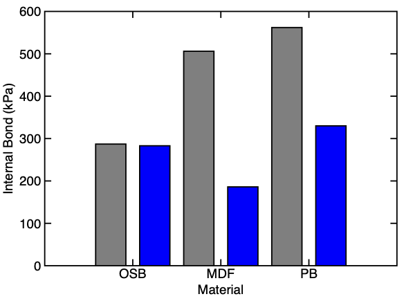
For a sample bar change, copy and paste the following table into a new window — it should create the plot shown below the table:
#setXTitle Material
#setYTitle "Internal Bond (kPa)"
#setSymbolLineWidth	0.25	0.25
#setSymbolSize	6	6
#setSymbolFillColor	gray blue
#setName	IB-Dry IB-Wet
OSB	287	283
MDF	506	186
PB	562	330
Working with Bar Charts
Each PublishPlot document can be all numeric plots or all bar charts — they cannot be mixed. The follow list explains differences when working with bar chart documents:
- All entries in the first column of data lines in the table, which are entries for x values in the bar chart, must be text labels:
- For non-numeric text, just provide the label. If the label has spaces or commas, enclose it in quotes. The label can use subscripts and superscripts by methods explained here.
- If the desired text label is a number or date (for example a bar chart for data from a series of years), preface the number with "PPLabel:" to designate it as a text label (e.g. "PPLabel:2021"). Once a table has one text label, the rest of the entries are automatically assumed to be text labels. Thus, the preface is only needed if the first label in the table is a number or a date.
- If the intended label begins in "#", preface it with "PPLabel:". This preface is needed any place in the table to be sure the line is not misinterpreted as a table command.
- By default, bar charts are drawn with "Vertical Bars", no lines, and with zero included in the y axis range. If desired, these can be changed to any other settings in the inspector window.
- The width of vertical bars is controlled by the symbol size, but will never be wider then the space available for each labeled quantity. To maximize the bar width, set the symbol size to 100%. Warning: although any symbol type can be used, only vertical are widths are automatically adjusted to fit; adjust sizes of other symbol types as needed to fit.
- A bar chart document can include multiple data sets. When data sets share an x label, their bars will be plotted side-by-side above the label.
- You can use statistics calculations with bar charts by entering multiple data values having the same x label. Note that if you do not activate statistics for such a plot, multiple bars with the same label will plot on top of each other.
- Data transformations are limited to transformations of y axis data only (and two y transformation options not applicable to bar charts are disabled).
- Bar charts can have y direction errors bars but not x direction ones (and #PPXError columns for the x direction ones in tables will be ignored).
- You cannot plot expressions in bar chart documents.
- You can convert a bar chart into a stacked bar chart by downloading the Stacked Plot script.
- Horizontal bar charts are not directly supported but can be created by the manual method described in the next section.
Because numeric plot and bar chart documents cannot be mixed, how can you handle superposing a numeric plot on a bar chart. Consider the following example. The bar chart for "Control", "Better", and "Best" could easily be created with built-in bar chart methods, but this plot also helps to visualize the data by plotting raw data points spread across the bars for visibility. Such a plot requires a numeric plot.
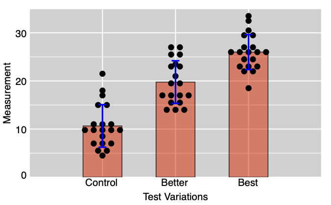
Creating such a plot that combines bar charts with numeric data is a two step process:
- First create a bar chart within a numeric plot. The process is described below. It was the only method available for bar charts prior to version 2.4. It is a method that still works and is now only needed when you want to mix numeric plots with bar charts.
- Once the bar chart is created in a numeric plot document, you can add any numeric plots you want to that document. The above example adds a plot of raw data points.
The basic steps to manually create bar charts within numeric plot documents are as follows:
- Create a plot with bar chart data. The numeric x values for vertical bar charts should be equally spaced (such as 1,2,3,...). For horizontal bar charts, the numeric y values should be equally spaced instead.
- Select "Vertical Bars" or "Horizontal Bars" for the symbol type (as appropriate for bar direction) of your plot. Normally you select "No Line" to plot bars by themselves without connecting them with lines.
- For desired appearance, set the symbol size to change the width of the bars. You also can fill the bars with a color or a pattern.
- Change the bar axis minimum and maximum to adjust spacing to the left and right of the bars. Remove the axis title (if desired) and set color of tick labels to match the background color (because the equally-spaced numerical values may not be relevant).
- To label bars, add plot labels. If you want the bar labels to be under the bars when using "Vertical Bars", turn off "Automatic" ranging for the y axis and then drag the labels to the space below the plot. Similar methods can be used to place labels to the left of "Horizontal Bars," but the space available is more limited.
- You can add error bars to your plot data or use statistics to plot standard deviation bars for groups of data at each bar location.