
Statistic Calculations and Plot Features
If your data are a collection of observations, you can enter all observation points into one plot and ask PublishPlot to do some simple statistics calculations and plot the results. The three options are to plot standard deviation error bars about mean values, to replot your data using a box & whisker style plot (with or without outliers), or to replot your data using a violin style plot (with or without outliers)
Statistics "Error Bars"
To use a statistics option, choose "Standard Deviation," "Box & Whisker," "Box & Whisker/Outliers," "Violin," or "Violin/Outliers" in the "Error Bars / Statistics" section for customizing plot data. These selections plot statistics graphics evaluated from your entered data. The following two figures show a standard deviation plot and a box & whisker plot without outliers:
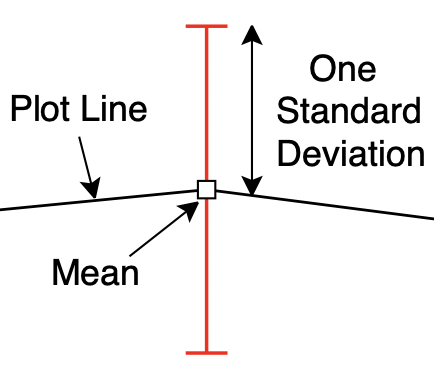

Standard Deviation Box & Whisker (without outliers)
The following two figures show a box & whisker plot with outliers and a violin plot without outliers:
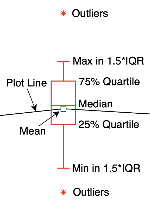
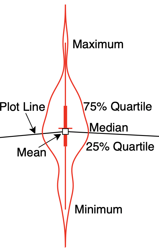
Box & Whisker (with outliers) Violin Plot (without outliers)
- The plot data (which you can edit in the inspector) should simply list all data observations as (x,y) data points. They need not be sorted by x or y values.
- Statistics calculations are done for all data with the same x value. If the x values are not exactly the same, you can enter a box width in the "tolerance" field. The statistics will then be done on groups of x values within boxes having the entered width. The default value is zero, which analyzes data with equal x values.
- For bar charts statistics calculations are done on all data with the same x label, which means the "tolerance" setting is not used.
- The "Standard Deviation" option plots error bars for each group of x values of length ±1 standard deviation about the mean.
- The "Box & Whisker" option plots a box from median of bottom half of the data to median of top half of the data. For large data sets the box is from 25% to 75% quartiles of the data and the box is called the "interquartile" range or IQR. The line across the box is at the median of all data. The whiskers are drawn as error bars between the minimum and maximum data values (note that by definition of median, no whiskers appear unless the data set for the box has at least 4 data points).
- The "Box & Whisker/Outliers" option also plots an IQR box. The whiskers are adjusted to be between the minimum and maximum of all data values that are within 1.5*IQR of the box edges. Any data points more than 1.5*IQR away from the box edges are plotted as "outlier" points.
- The "Violin" plot replaces the box in a "Box & Whisker" plot with a probability density estimation for data points at that x value. The line down the middle provides the same information as a "Box & Whisker" plot except the box is replaced by a thicker line.
- The "Violin/Outliers" plot is similar to a "Violin" plot execpt the line down the middle is based on "Box & Whisker/Outliers" plot and "outlier" points are plotted.
- The statistical features control error bars, boxes and whiskers, or probability density estimates drawn at each point, which are the features in red in the above figures. You can customize error bar, box & whisker, and probability density appearance using the methods for customizing plotted data sets.
- Mean values found in the statistical analysis can be connected with optional plot lines and plot symbols (or can be hidden) by customizing the plotting features of your data set. Note that plot lines and symbols will be drawn through the data mean values. The mean values will be exactly in the middle of standard deviation errors bars, but may differ from the median lines in box & whisker or violin plots. Also note that lines connecting the mean values will be covered by boxes and probability density regions unless their fill opacity is less than 100%.
Sample Statistics Graphics
To see some statistics features, copy and paste (or drag and drop) the text in the following plot to a PublishPlot document. The results will be a plot of two mean values (for x = 0.5 or 1.5) with error bars equal to standard deviation of all data for each x value. To try a box & whisker or violin plots (with or without outliers), select one of those options in the "Error Bars / Statistics" section for customizing plot data.
#setColor         black
#setLineType      none
#setSymbolType    square
#setErrorBarType  2
#setErrorLineColor red
#setName          "Stats Data"
0.5                525.8
0.5                605.7
0.5                843.3
0.5                1195.5
0.5                1200
0.5                1250.4
0.5                1345.2
0.5                1400
0.5                1423.9
0.5                1456.3
0.5                1945.6
0.5                1955.6
0.5                2208.7
0.5                2950
1.5                410
1.5                727.7
1.5                1086.5
1.5                1091
1.5                1200
1.5                1361.3
1.5                1400
1.5                1490.5
1.5                1500
1.5                1956.1
1.5                2200